.jpg)
Hiya there,
I'm SMEG!
I'm a home appliance company from Italy, most well-known for my retro-inspired designs.
+
Let me explain this exercise...
1. Brand
The goal of this exercise was to practice brand language and design. The first step in the process was analyzing a brand's aesthetics and material identity.

2. Object
The second part of the project was to identify an object that would fit within the brand's current set of products.

3. Journey
The final portion of this exercise was to demonstrate the usage of the final product and visualize the consumer journey.

What Makes SMEG, SMEG?

Form:
Rounded Edges
Spherical Levers
Not Subtle
Dials for UI/UX
Round, but not
organic/flowing

CMF:
Chrome is Vital
Soft Finishes
Retro-esque
Glossy & Matte
Pastel Colors
The Chosen Product.
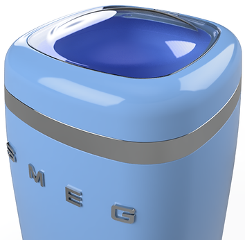
After looking through SMEG's host of 'retro' products (both available and discontinued), I thought it would be an interesting challenge to visualize what a SMEG portable washing machine would look like.


A Sketching Sprint!
I already had a good idea of what this washing machine might look like, so I did some quick "napkin-sketching" to solve the parts I couldn't visualize and then jumped into CAD for some 3d sketching.


Early Render Passes!
After getting a general idea of the final product, I added some more refined materials to the models for initial rendering.


The Final Product.
After getting a good general form for the washing machine, it was time to finalize the fine details and visually elaborate via rendering.


The User Journey.
The final part of this exercise was to compile and illustrate how a user would interact with this product.
_edited.jpg)
_edited.jpg)


